Annotation

1 BACK 1 2 BACK 2 5 16 BACK 16 17 BACK 17 37 BACK 37 38 BACK 38 41 42 43 51 52


Annotations of John Gordon Rattenbury’s autobiography. I read the 50+ page autobiography, and chose these pages to portray Johns story. These pages show how the war was introduced to the people, and also an insight into Johns life. They also portray the war from a unique perspective, showing how most of the time it was just waiting around, in some way having a holiday around the world for a few years. This makes a really interesting read, and broadens my understanding of the soldiers time in the war, as well as showing the realism of war.

Annotating the pages in the way has also helped visualise the script, and how I will go about creating each shot, whilst also knowing what archive footage I will need.

Film Trailer

This is the trailer for my film, which gives a brief introduction into the style and format of my film, as well as interesting information that may help towards the audiences appreciation towards the film. This is shown through telling the audience that is based on a autobiography, implying the story is a true story, adding interest for the audience. The trailer also shows how the film will be edited and created, with still images and interesting sound track. As the images are all of Paris, this will imply the film will be set in Paris and/or Europe, with also giving context to the era of the film with the opening text, showing that the film is based around the time of the second world war, setting up for a WWII film.

(Photo Credits: Serio K – Albert Vauthier Guidoux, Kent Kanous, Wayne Ray)

50 Years On Film Poster

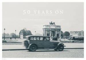
50 Years On Poster(“50 Years On” film poster. Photo credit Serio K – Albert Vauthier Guidoux.)

The basic imagery and use of font shows the simplicity of the film. I chose this image due to the european context; film starts in Paris, and the use of the moving car; 1940s style of car showing the films era, as well as moving through the frame, portraying that evacuating Paris may occur.

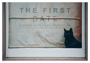
Similar to the poster I made for “The First Date”, I feel the white text and border help create a more minimalist style, as well as not introducing the image completely. I chose to overlay the text over the image, to make the text have a similar role to the image, as it has important facts about the film that should be acknowledged.

TFD F(“The First Date” film poster)